Partner: PODS Moving and Storage
Role: Art Director, Designer
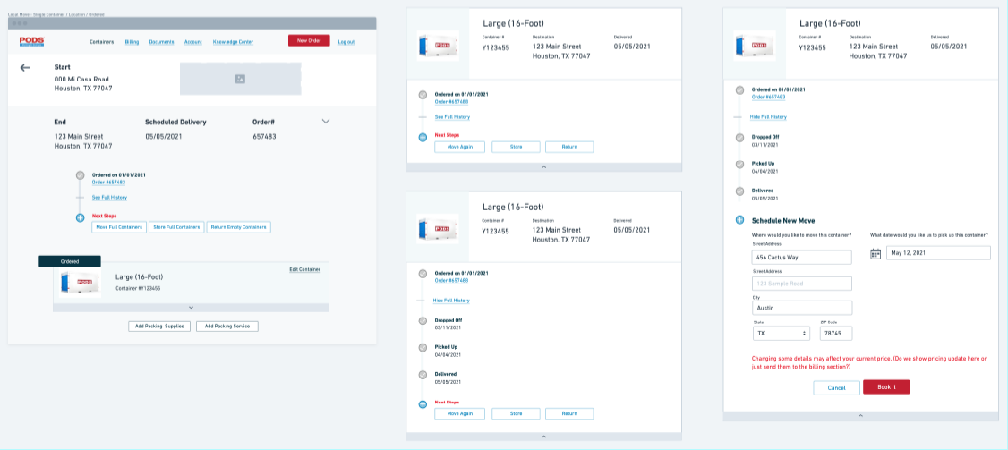
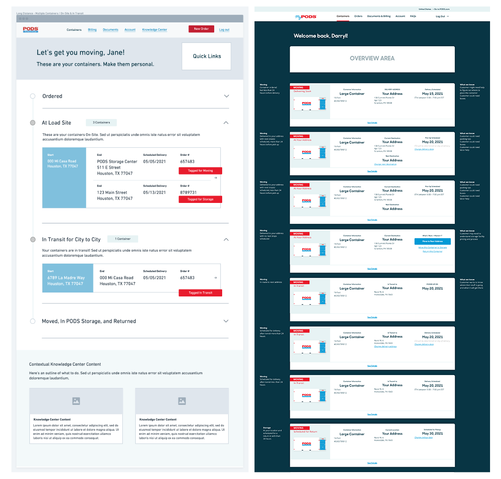
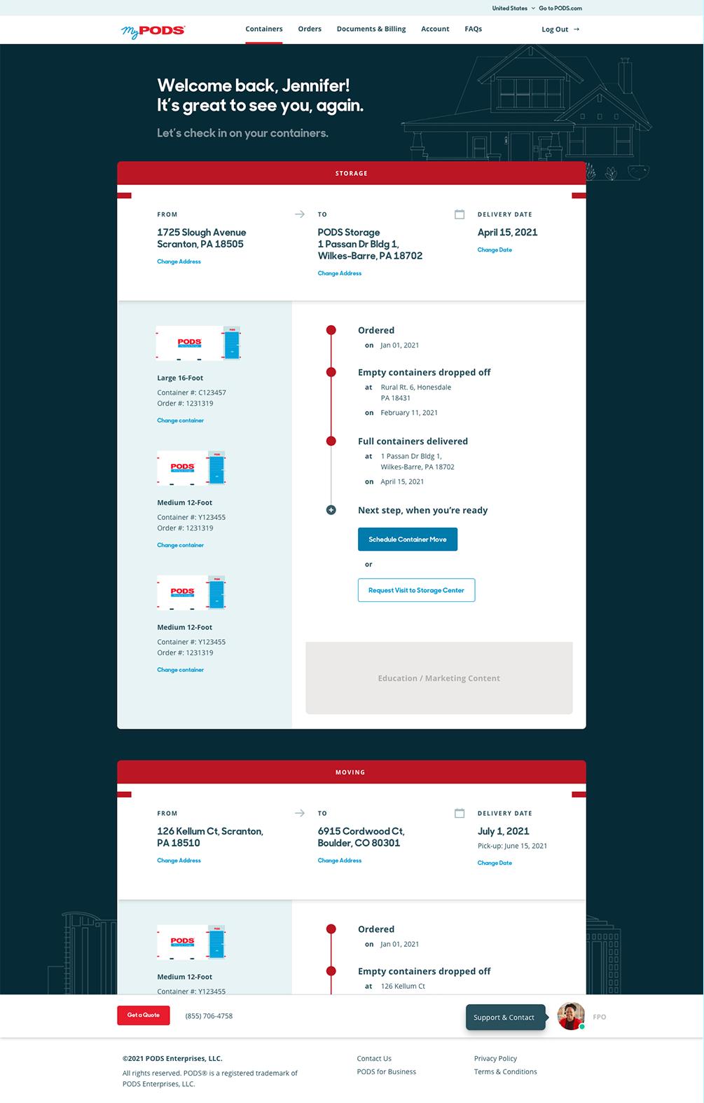
PODS wanted to re-imagine their site experience, which primarily focused on the booking, delivery, and management of moving containers. In addition to implementing a newly-developed brand look and feel, the site needed to:
- Present a simplified user experience in an intuitive and efficient way.
- Provide a single portal solution to service both residential
and commercial customers. - Empower customers to control container reservations, pickups, and delivery, thereby decreasing calls to the service center.
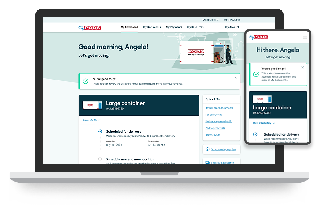
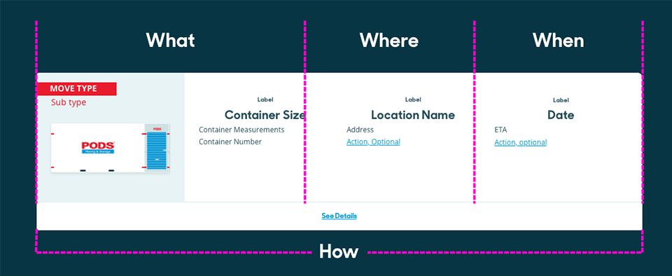
Pack it up, pack it in
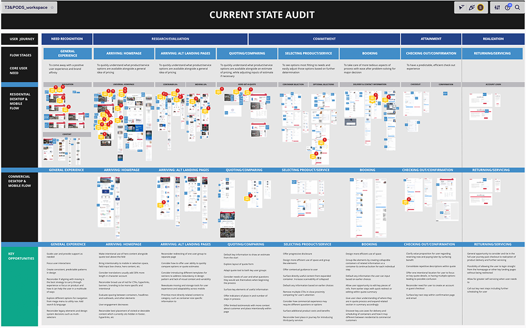
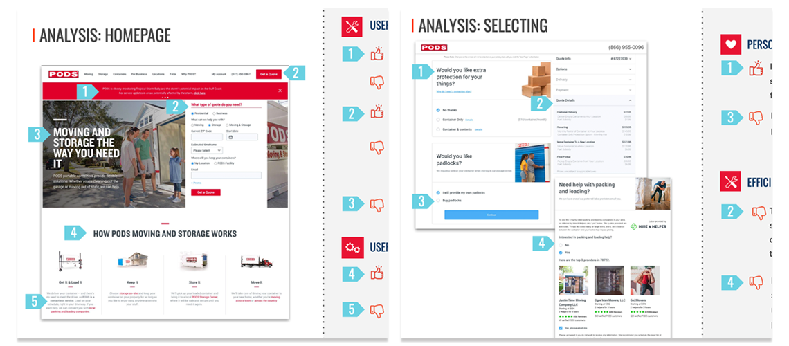
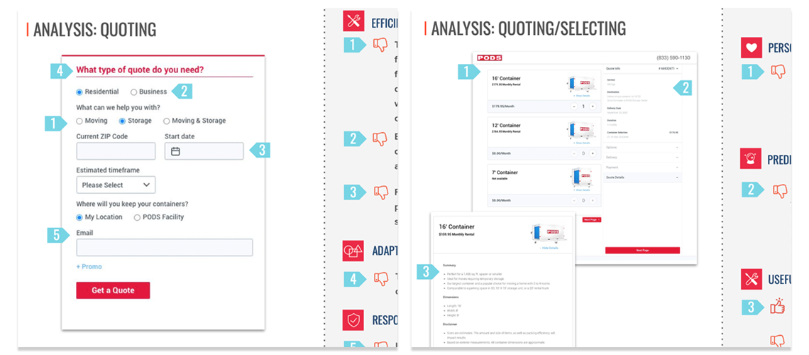
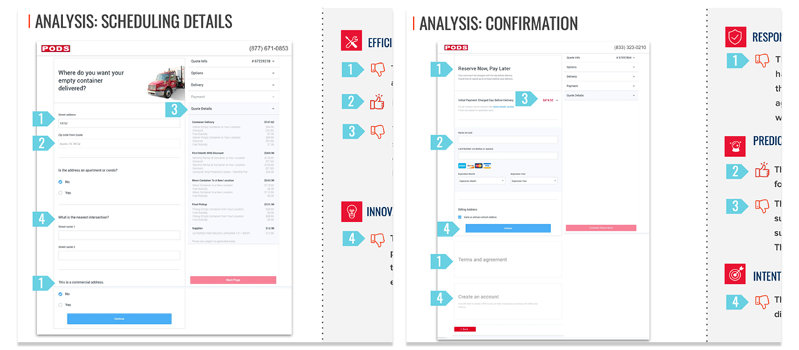
While interviewing PODS’ customers, many expressed frustration with the existing site’s confusing tools for booking and management. Customers were having difficulty navigating a complex system (which, to be fair to PODS, is actually really, really complex on the backend) and desired a more guided process.
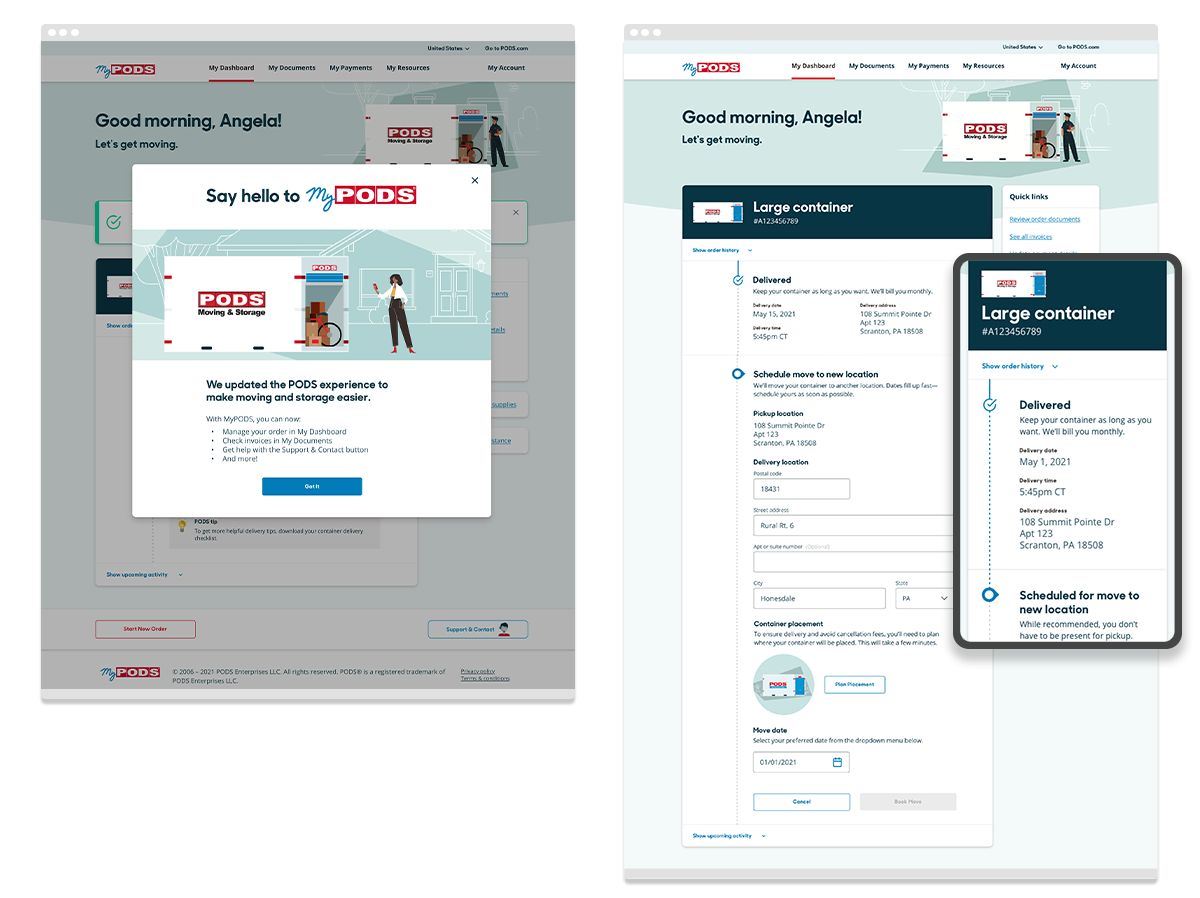
To build the experience, I worked closely with T3 Agency and their research team in help support six priority tasks:
- Book and update reservations
- Track containers by location and phase
- Easily find invoices and necessary documents
- Access FAQs tailored to needs
- Quickly and easily contact customer service
- Clearly guide with feedback and confirmation
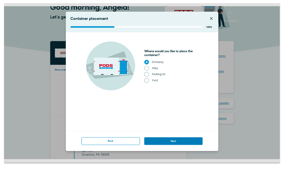
Making things simple can be complex
The design had to be simple. To do that on the surface, we had to untangle and sort the connective wires below it. And, to reiterate, the backend was a complex system that was dependent upon timing, distance, business type, access, inventory, and regional laws.
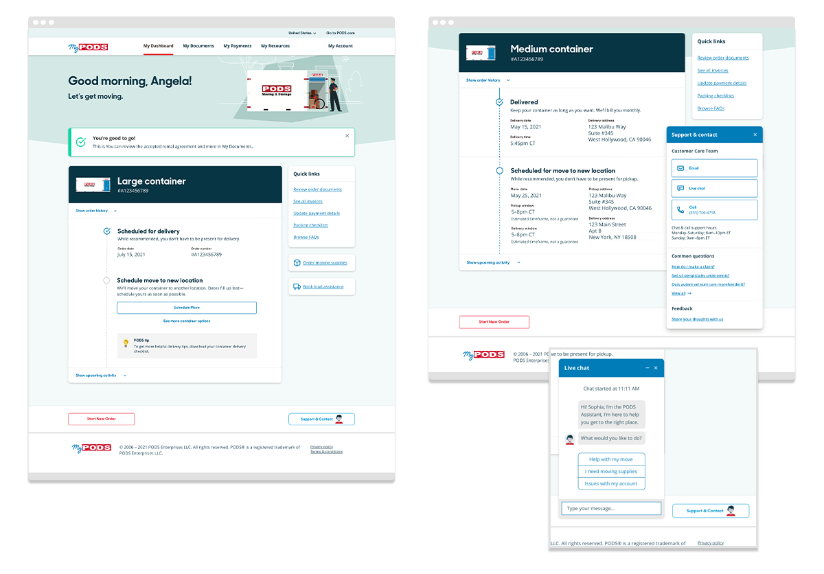
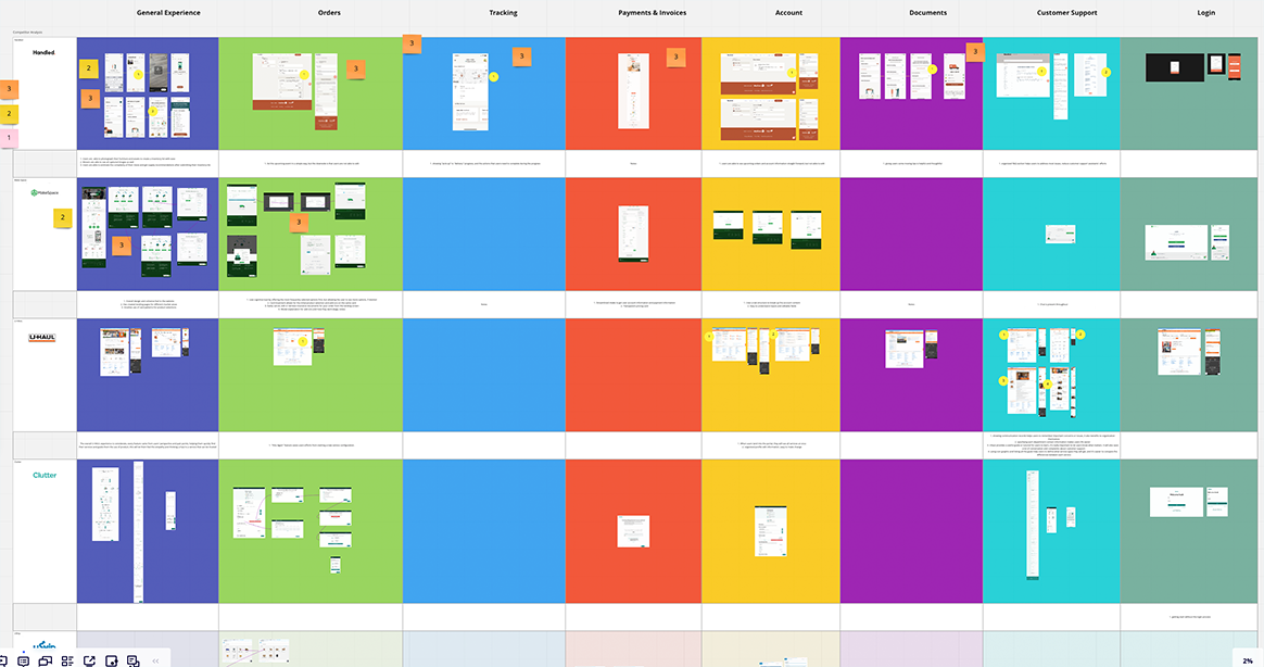
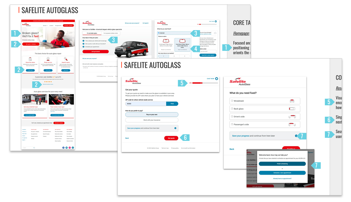
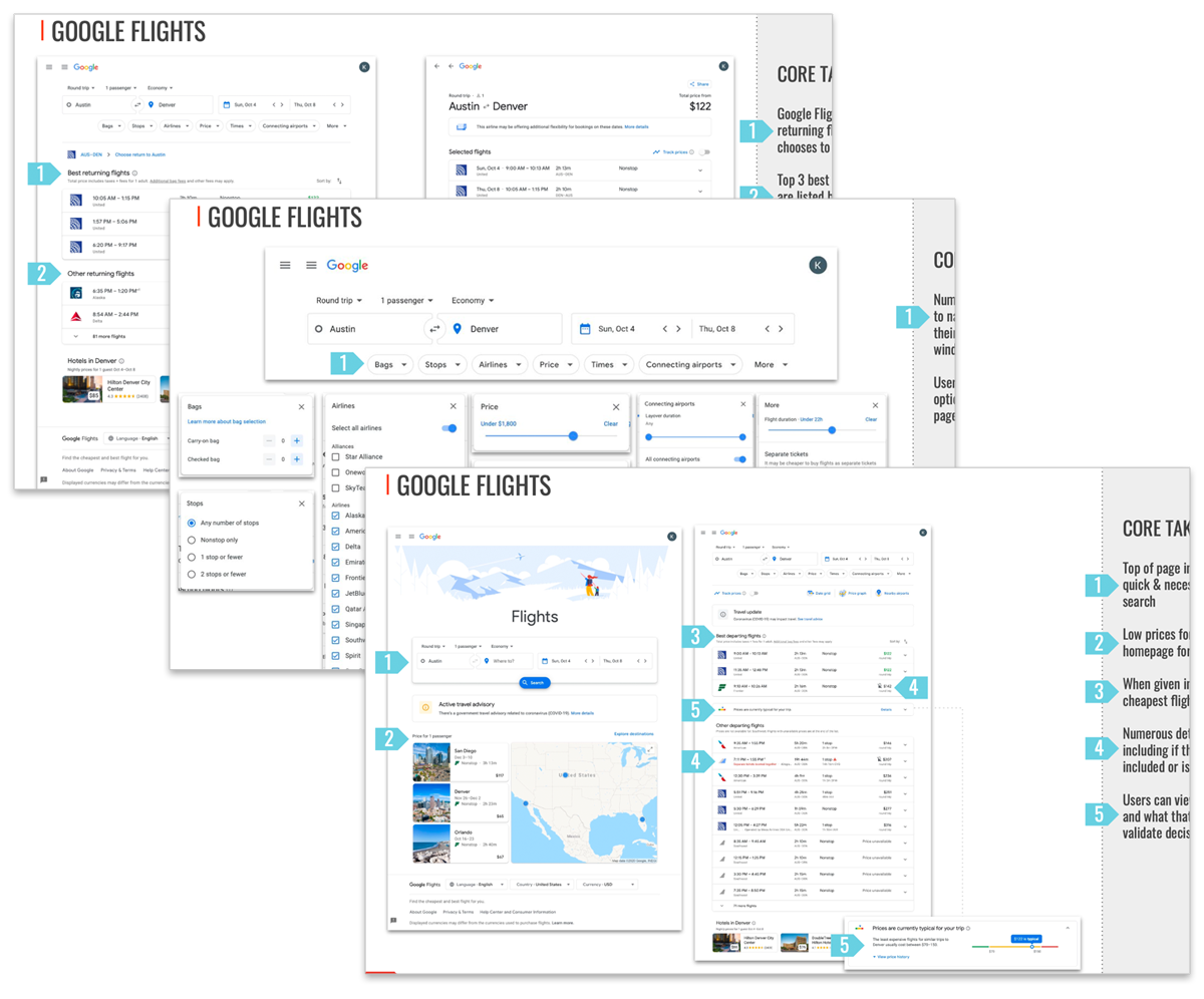
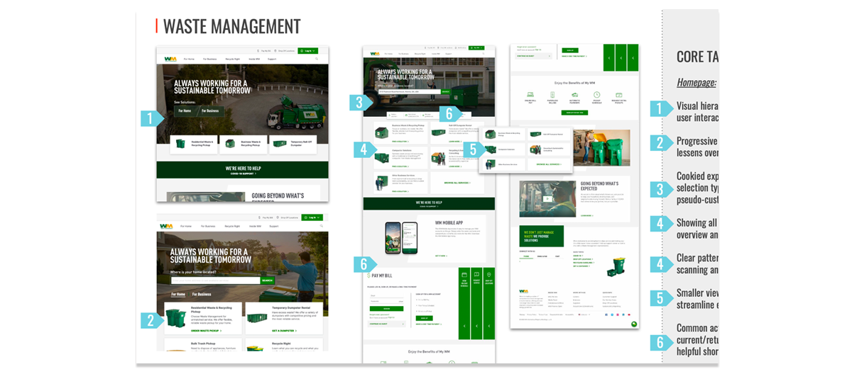
We used audits of PODS’ existing experience, business competitors, and non-industry companies to inform what was most important, what could be leveraged, and what could be modified <insert Always Sunny connections meme>. There were innumerable variations and iterations before we settled on a solution.
Current Site Audit
Competitors Audit
Iterations