Target Employer Brand
Partner: Target
Role: Creative Director, Art Director, Designer, Illustrator
Target’s Talent Acquisition department is responsible for recruiting, hiring, and developing the company’s workers. The team’s efforts span multiple channels and require wide-ranging marketing. For many years, TA created those assets using their own unique look-and-feel.
This led to candidates and employees having a disjointed experience from the Master Brand, and, over time, the existing style guidelines began to feel stagnant. The visual design language and core messaging needed to better reflect Target’s desired positioning in the market.
Red, white, and round
Aligning the Employer Brand to, and reinforcing, the Master Brand was the obvious approach: candidates and employees experienced both brand expressions in the same exact same way through advertising, in-store marketing, and outreach events. And, emphasizing the classic styling would help improve efficiency and execution, maintain trust and experience, and encourage longevity of materials.
After auditing Employer Brand’s materials, I outlined specific goals:
- Simplify visual presentation for added clarity.
- Emphasize classic red, white, and black branding.
- Lessen grid structure to allow for more flexibility.
- Allow for more versatility in types of featured design elements.
- Expand beyond limited photo library.
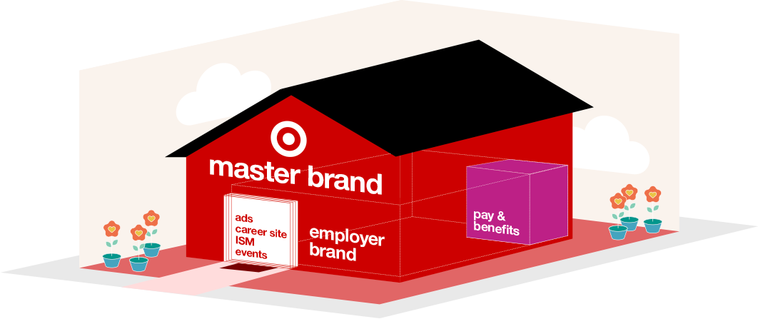
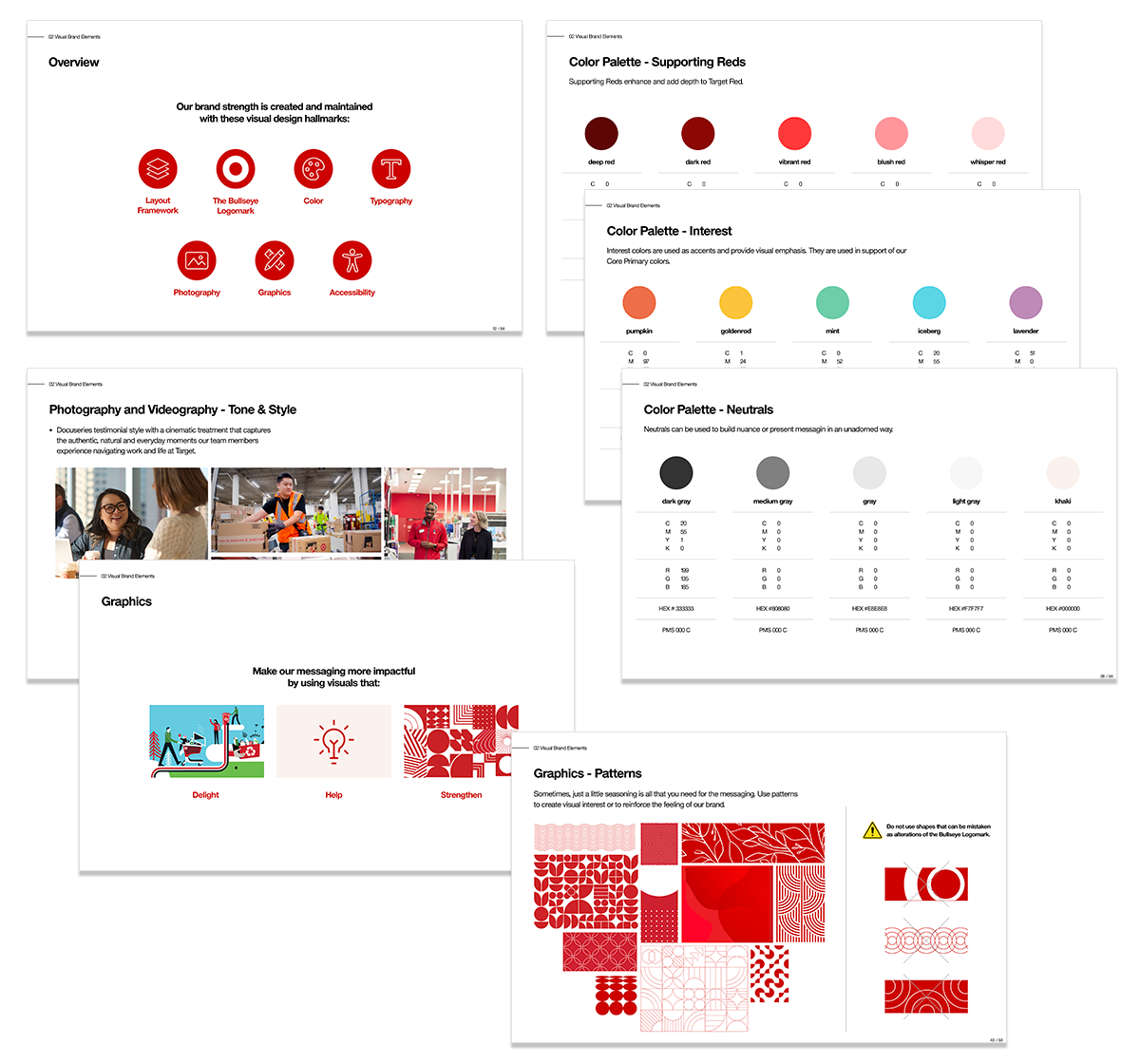
A significant challenge, however, was the master brand guidelines itself. Certain governance was clear, like how to use the Bullseye logomark, but broader topics, like the color palette, photography, and graphics, weren’t defined. That resulted in inconsistency across multiple executions (and many cases of off-brand assets) because creators were interpreting the guidelines differently (or improperly).
Using the master brand guidelines as the foundation, I identified any deficiencies and began the work to define how new messaging should be visualized. Established guidance was leveraged to inform decisions, and new guidance was developed or adjusted to fill in any gaps.
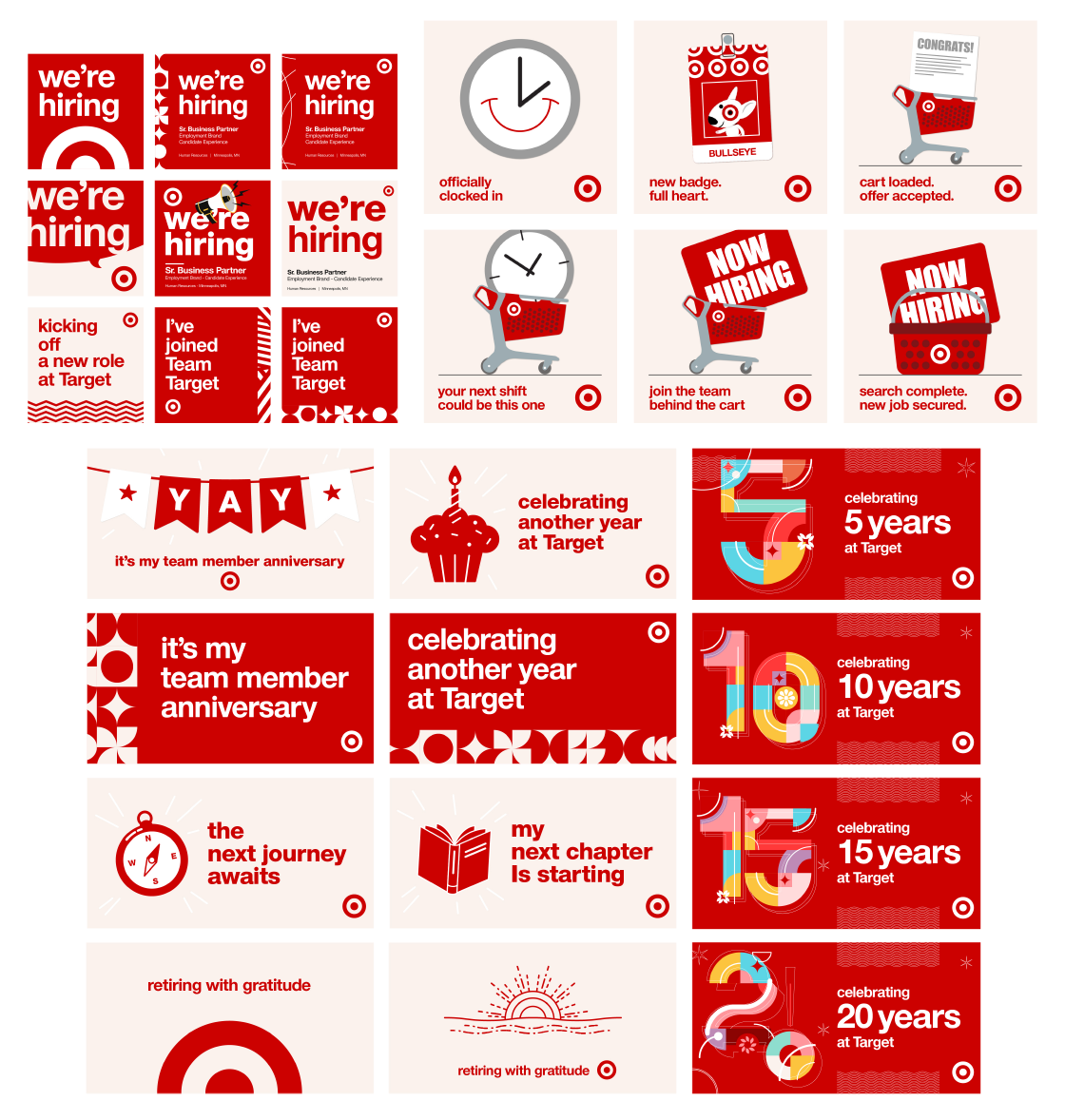
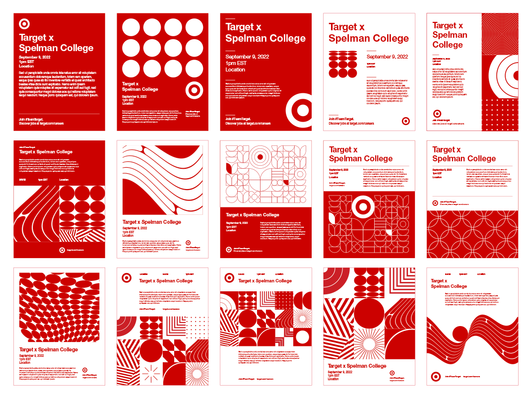
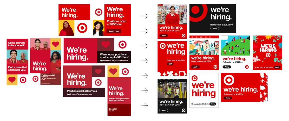
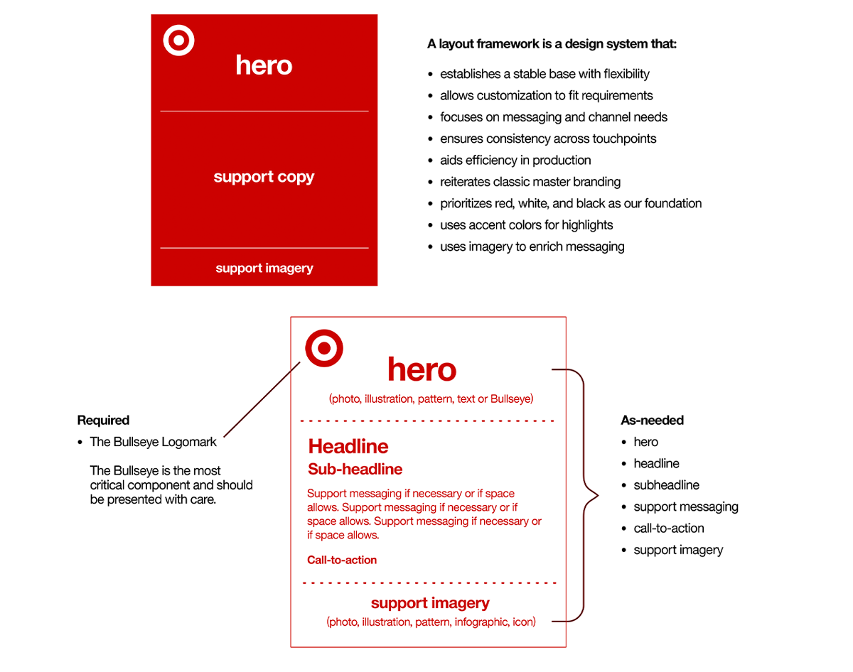
A fundamental aspect of the work was to shift the priority from layout to content. The container elements of the existing styling inherently limited how content could be presented. Focusing on the messaging instead would determine how it should be expressed.
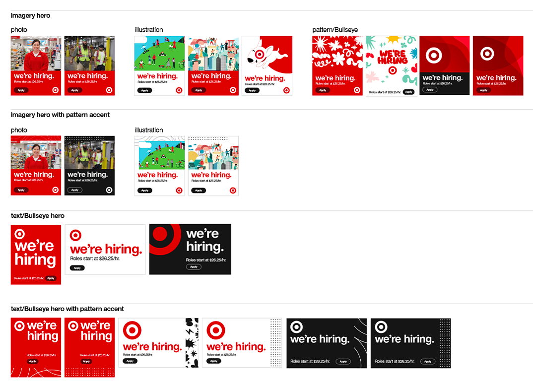
A second important aspect was diversifying the type of content that could be featured. Photography became a limitation, as the library was never refreshed and budgets didn’t allow for recurring shoots. The use of illustrations, patterns, and text would help expand possibilities and supplement the photography.
Treating deliverables like digital product components, where imagery and copy could be included, rearranged, or omitted as needed, would allow for flexibility and customization, while the supporting framework would provide stability and consistency.
A little bit of this, a little bit of that
Creating new assets for the field, either digital or printed, became a simpler task with the underlying framework to guide content development. Partners would be empowered to focus on the messaging, and then support it with the appropriate color, pattern, or graphic.