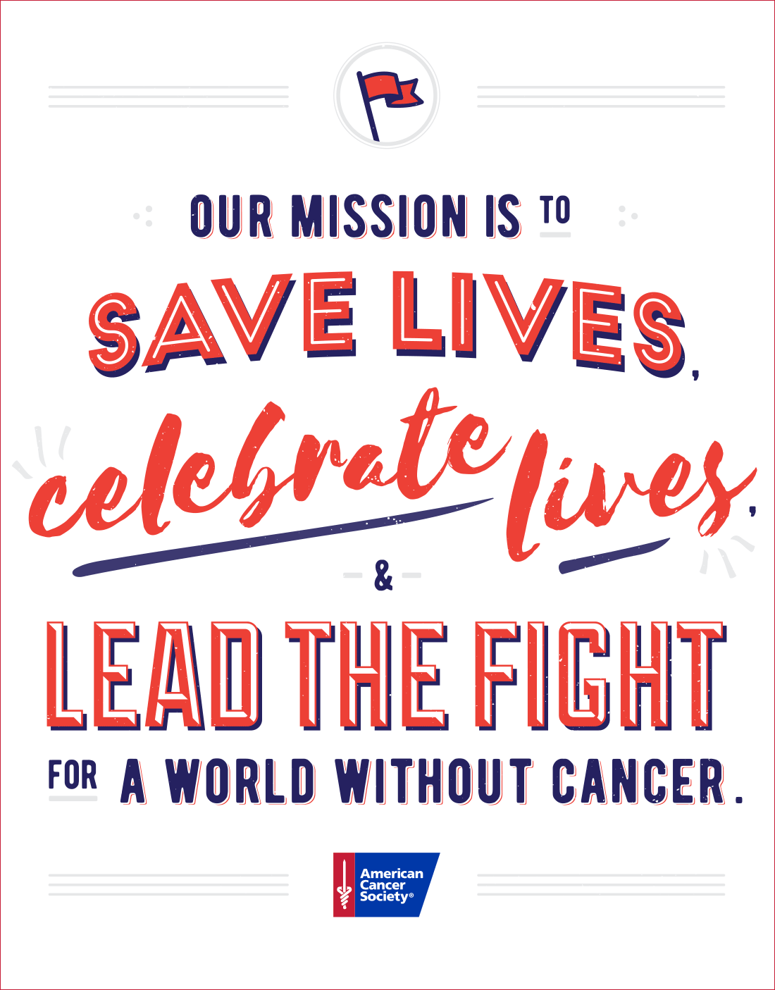
Client: American Cancer Society
Role: Art Director, Designer, Illustrator
Contributions: brand strategy, copywriting, creative direction
The American Cancer Society’s mission is dependent upon the support of donors, so being able to articulate the need for donations and then demonstrating the impact is critical. The trouble is that ACS has challenges on both accounts.
Most folks know about the American Cancer Society. But, not many people really know about the American Cancer Society. In fact, people often get ACS confused with other organizations and can’t actually explain what the company does.
The following work began as a way to rebuild the foundation for a more focused and coherent brand. Everything was stripped down to the bare essentials, so that the brand could function within its existing framework and evolve responsibly.
The messaging required a tune-up
ACS helps millions of people through a myriad of programs that include research, patient services, prevention, community engagement, and political advocacy.
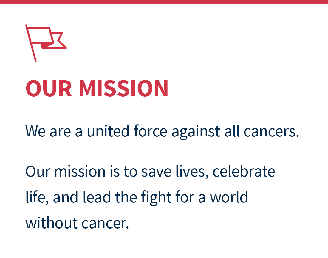
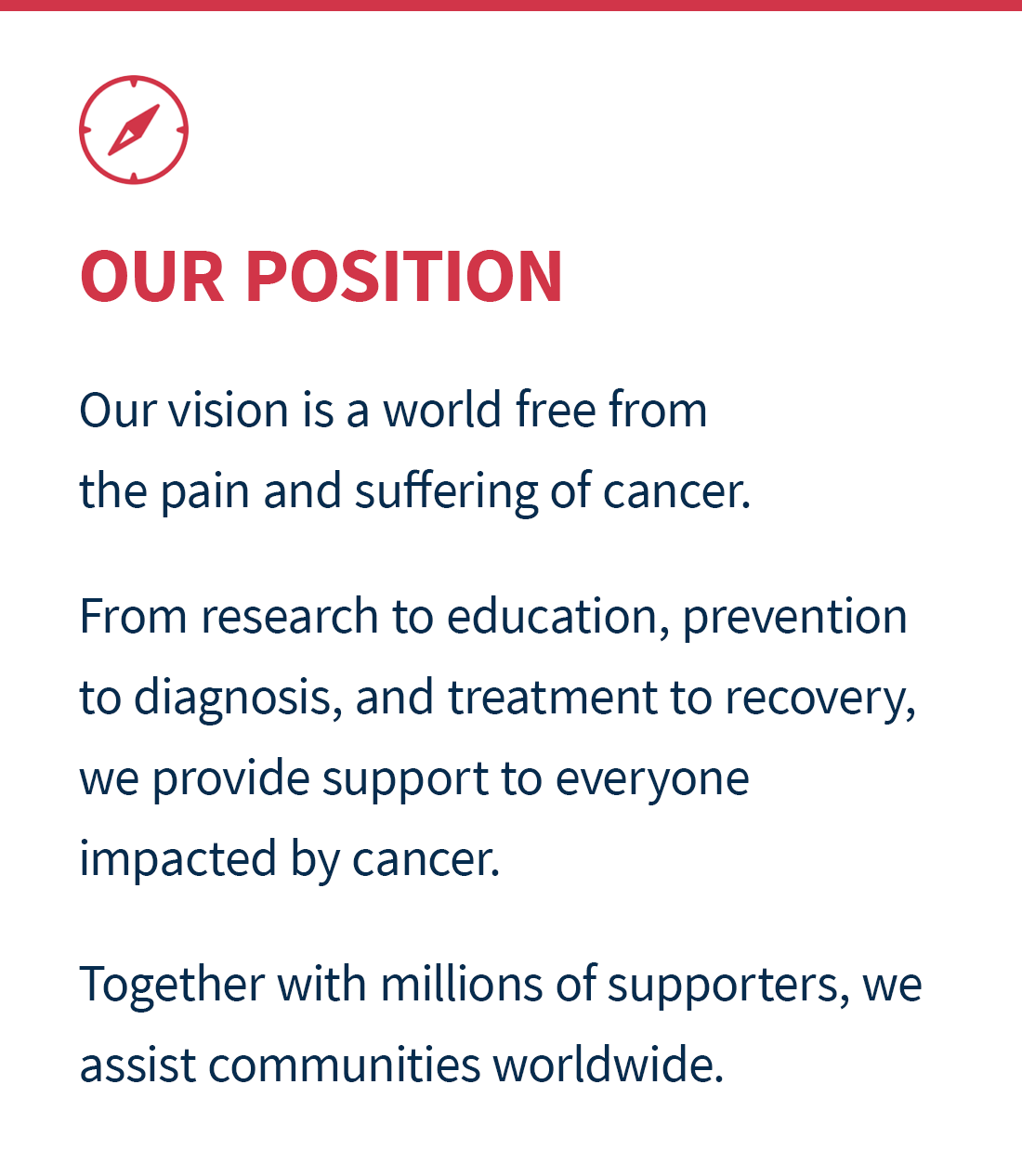
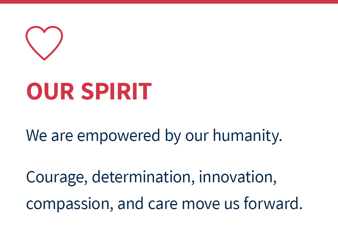
With such a broad spectrum, it was necessary to distill the complexity so that everything was more simple, direct, and understandable. AND, uniquely identifiable. AND, emotionally resonant.
Walk the talk
Cancer inherently involves fear, anxiety, and insecurity, so, visually, a sense of stability and trust had to be shown. To reflect the messaging, the design system had to be recalibrated for simplicity, accessibility, and tone.
Breaking down the system to just the essentials allowed for regression and progression as needed. The large non-profit, limited in its resources and extremely slow to change, necessitated a gradual transition, as the old and the new had to commingle for a very long time.
Palette
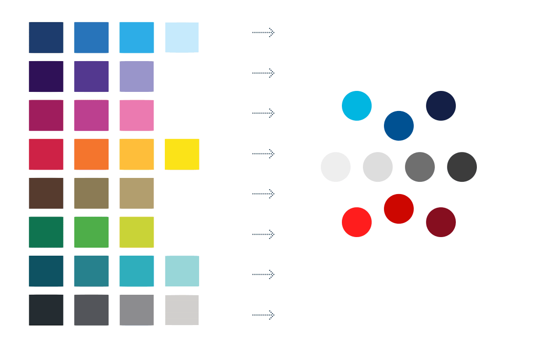
The palette was condensed to be more manageable and concentrated, with an emphasis on the core values from the logo, to help establish consistency.
Typography
A new type family was chosen to be web-based, friendlier, and more contemporary. Structural similarities helped minimize disjunction.

Photography
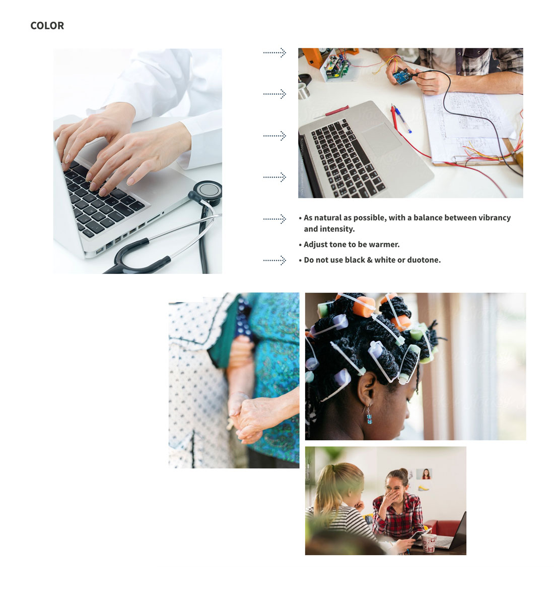
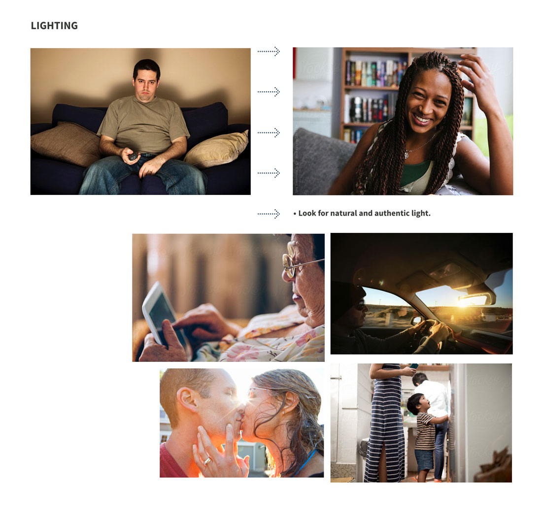
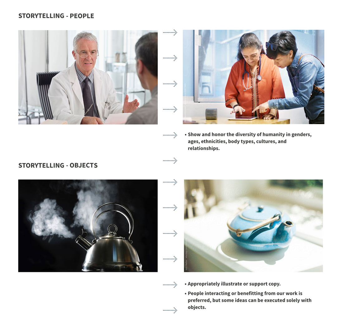
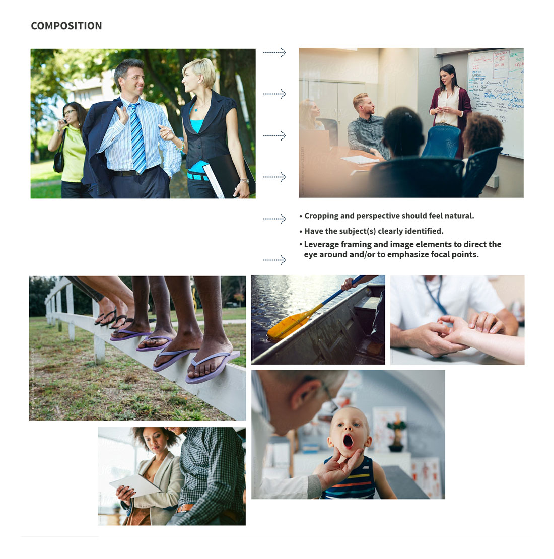
Photography offered the biggest opportunity for impacting the brand’s visual identity. Featuring powerful images was a priority, so the ingredients of effective imagery required identification and articulation. From storytelling to composition, an audit of existing images helped define deficiencies and how to improve them.
Crucial to everything was providing a spectrum of the human experience. A diversity of emotions, situations, and human qualities had to be represented, because ACS helps and is helped by everyone.

Iconography
Simplified iconography was created to support content and, like the photography, move beyond stock assets.
Hierarchy and Layout
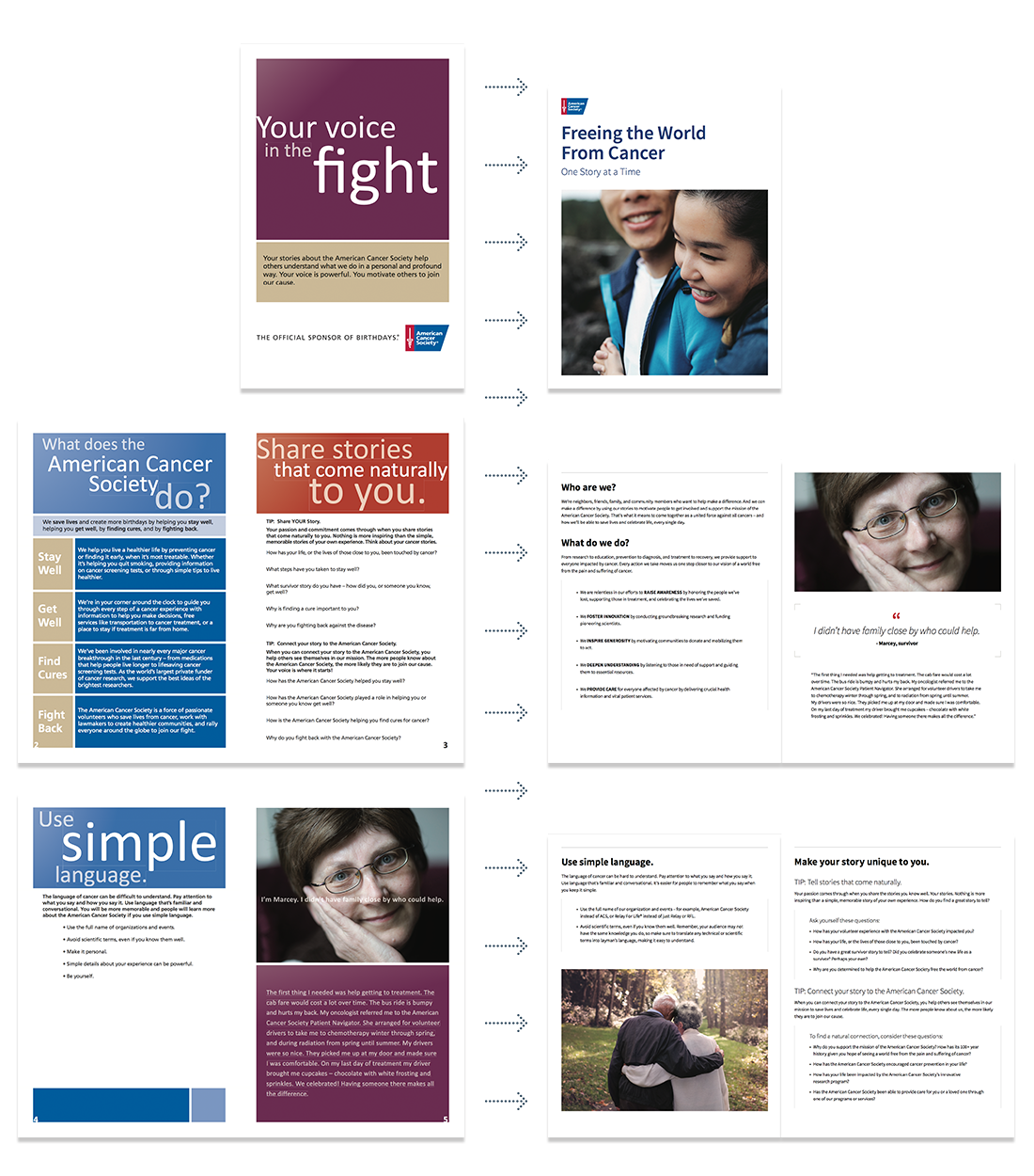
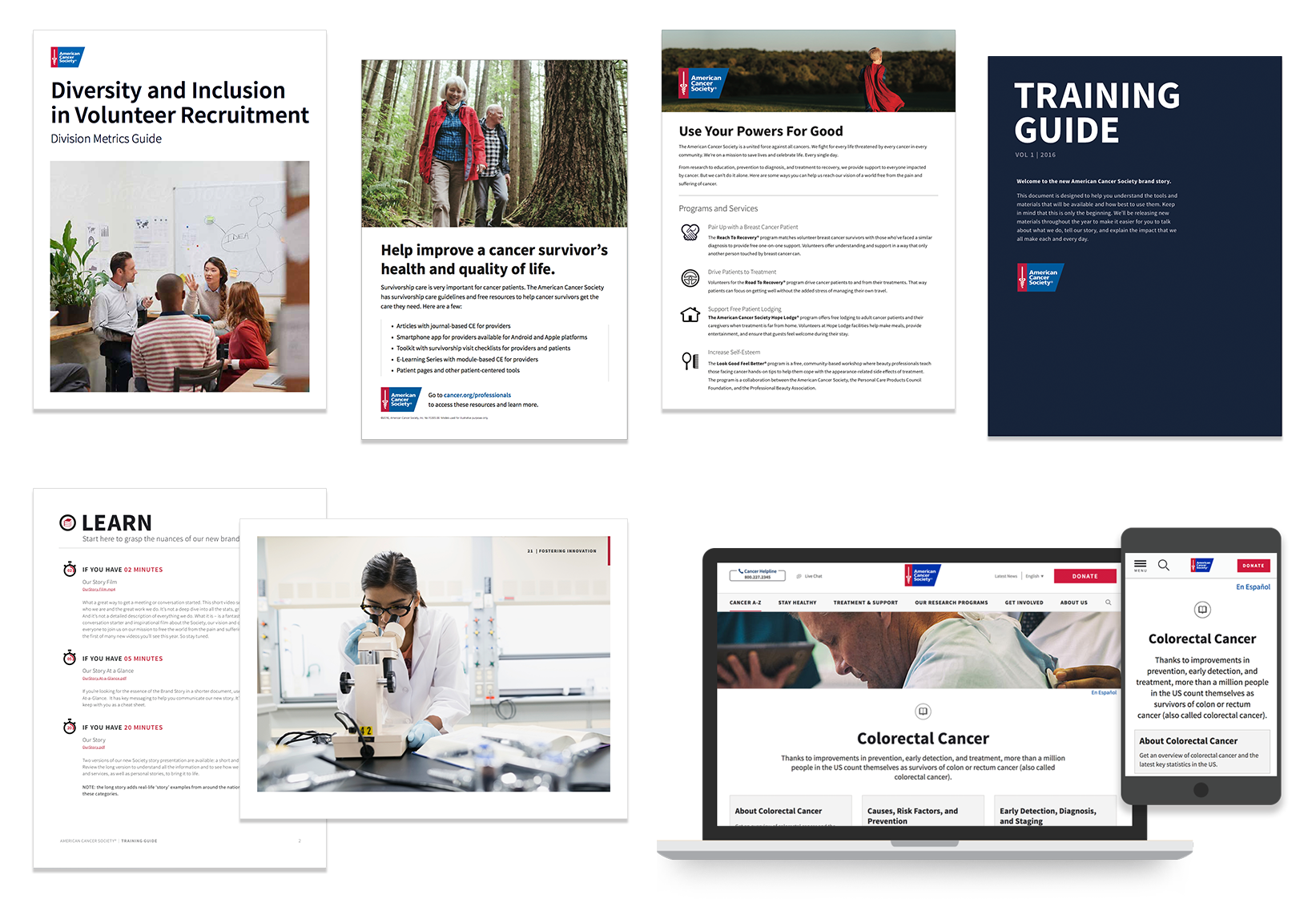
With the components determined, the new visual language was used to translate pieces in the field. A critical aspect of updating the pieces was to firmly establish hierarchy, a grid, and the “chunking” of copy, so that content could be easily scanned and digested. Finding information quickly is important, especially for constituents who have to contend with the duress of cancer.
Embellishments help show the personal side
Having consistency grounded every execution, but, most importantly, it provided a solid foundation for exploring the limitations as the brand developed.
One of the future aspirations for the brand was to visually amplify the humanity of the brand. That meant telling the story as “humanly” as possible, especially through the use of hand-rendered elements that could show the touch and the poetry of the organization.
