Client: IHG Hotels & Resorts
Role: Art Director, Designer
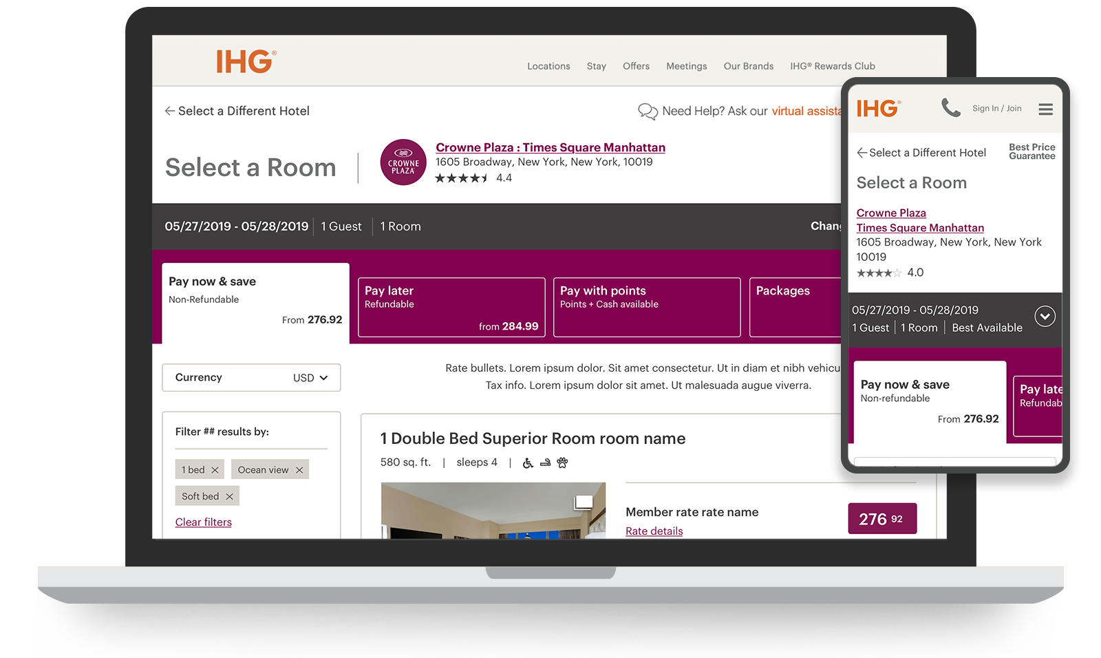
The InterContinental Hotels Group wanted to simplify and streamline their booking process. There were opportunities in the existing booking flow to improve the user experience by combining steps, elevating prioritized elements, and refining the interface.
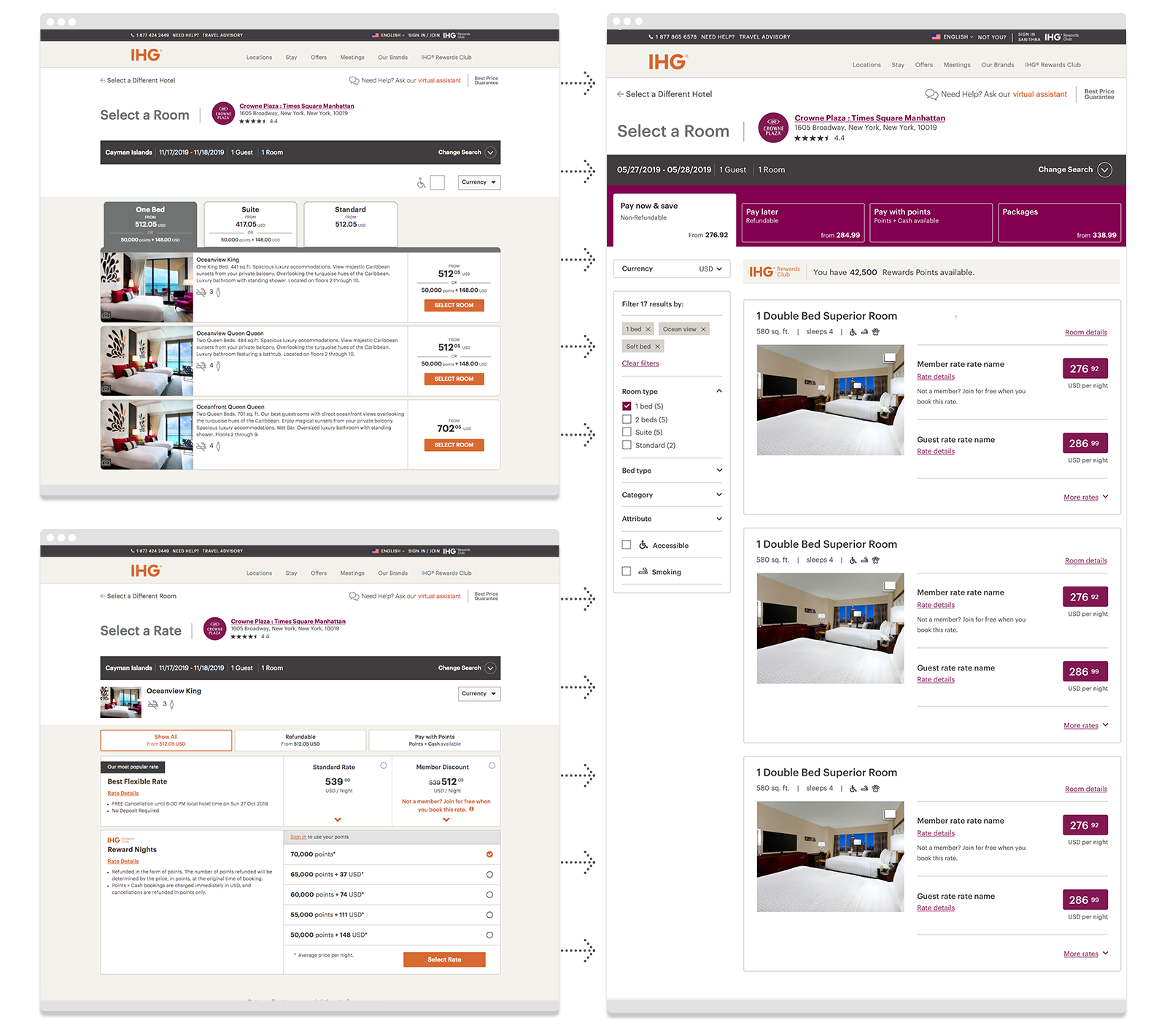
Simplifying the process was to be done over phases, to mitigate issues in development. The first phase involved merging two of the steps in the flow, the “Select a Room” page and the “Select a Rate” page, where there were dependencies in the choices.

Here’s some background info
The following visual design comps are deceptive. Merging two pages with unique tasks into a single page, that was clear, functional, and consistent with the rest of the flow, took a lot of effort. Working directly with product owners and developers, our UX team had to consider and find a solution that addressed:
Expansive set of rate codes
- Multiple payment options (money, money & points, points)
- Multiple price points (member, non-member, sale)
- Explicit tax information
- Package options
Filtering system
- Room details
- Rate details
- Room photography
- Rewards Club information
- Inconsistent lengths of copy
Accessible and responsive experience across all viewports
- Multiple languages
- Multiple hotel brands
- Existing styling


Do you have this in another size?
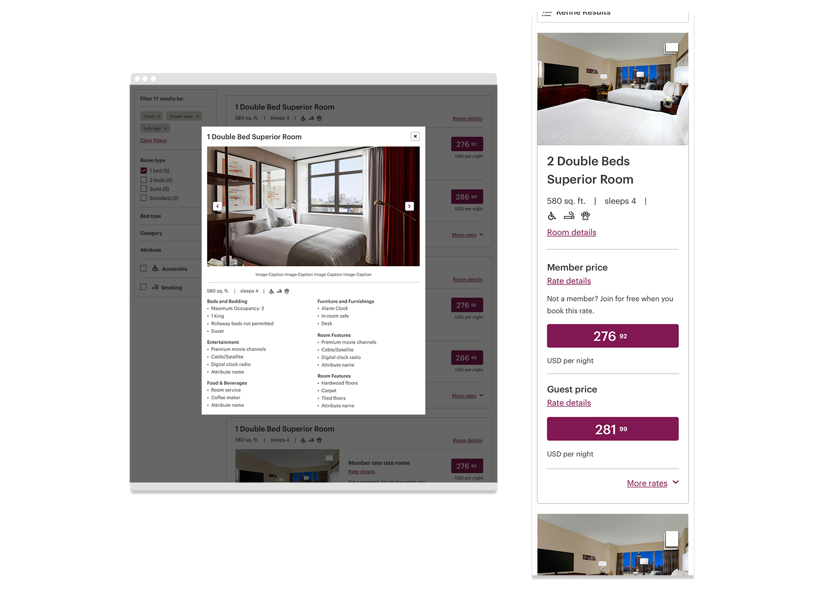
We spent a lot of time working through how the cards might be presented. These layout explorations, surveying the right amount of content and what functioned best, represent a small fraction of our iterative process. The designs were finalized through user testing.
