Client: Zeb Stephenson
Role: Creative Director, Art Director, Designer, Illustrator
Zeb Stephenson, an acclaimed and renowned chef, envisioned his first restaurant as something welcoming, comfortable, and creatively flowing. Above all, he wanted to make people happy with food.
For the Redbird team, simplicity and energy were critical ingredients for making the brand. Their passion had to be captured by approachable and hand-crafted elements, just like their cuisine.

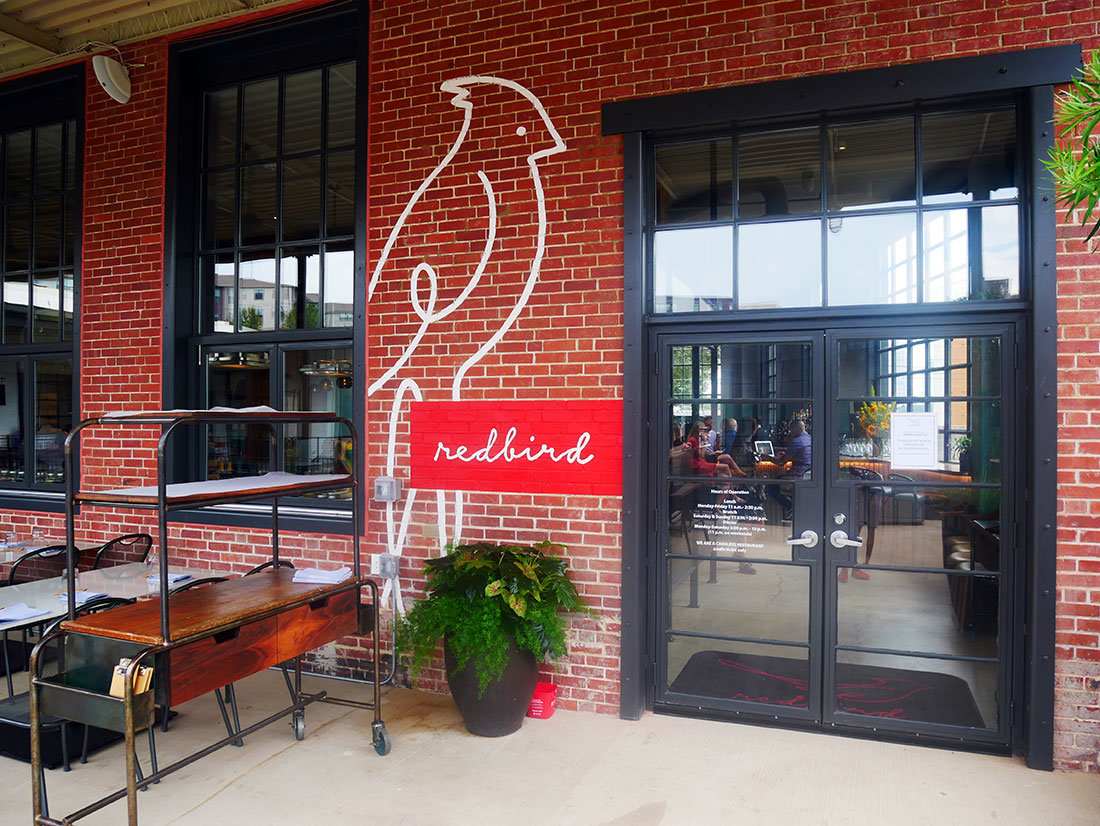
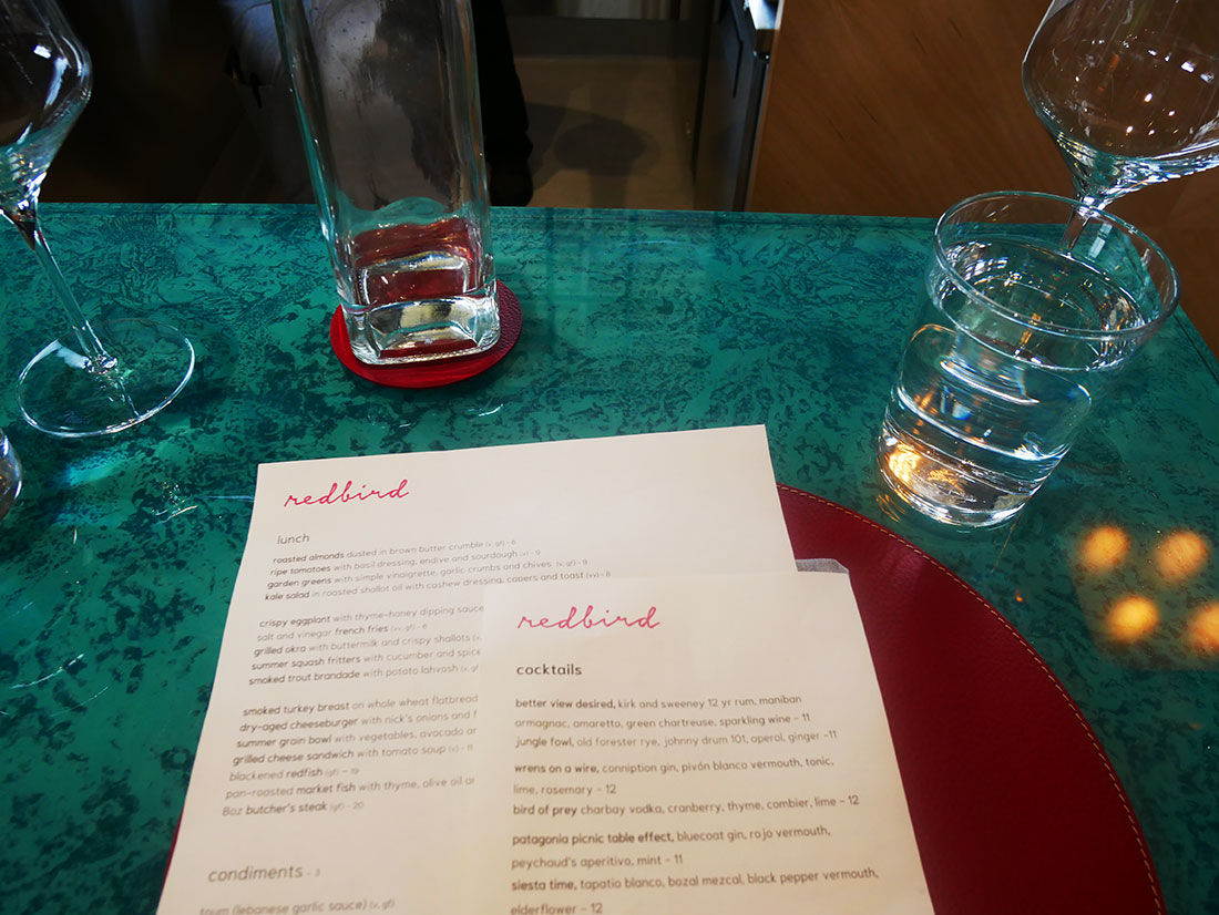
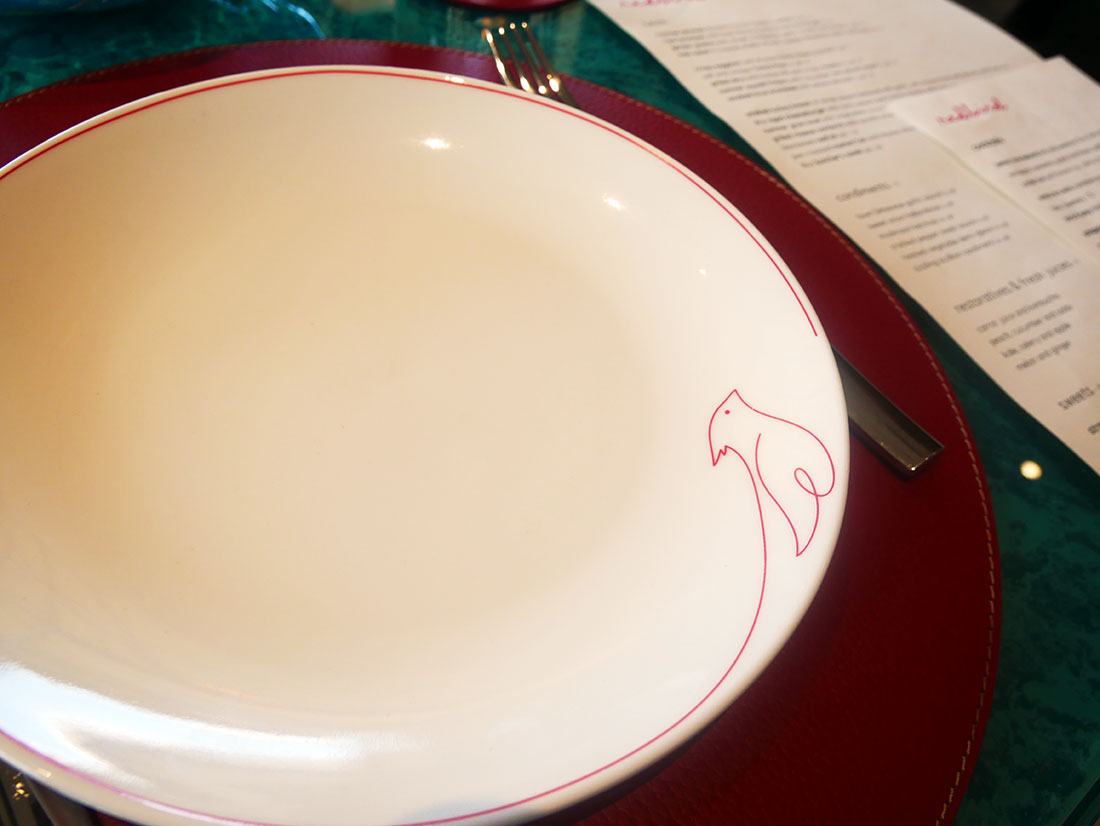
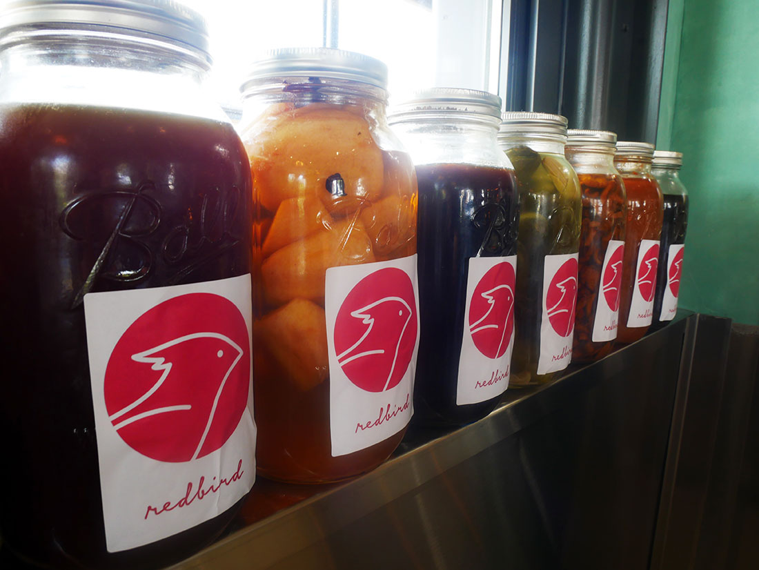
Here’s some background info
Through conversations with Zeb, we began to identify what cooking means to him, how he wanted people to experience his food, and how he approaches the act of creation. His responses directly helped me develop the brand purpose, brand position, and brand personality, as well as how the visual identity should represent the restaurant.
Does it swoop or does it sweep?
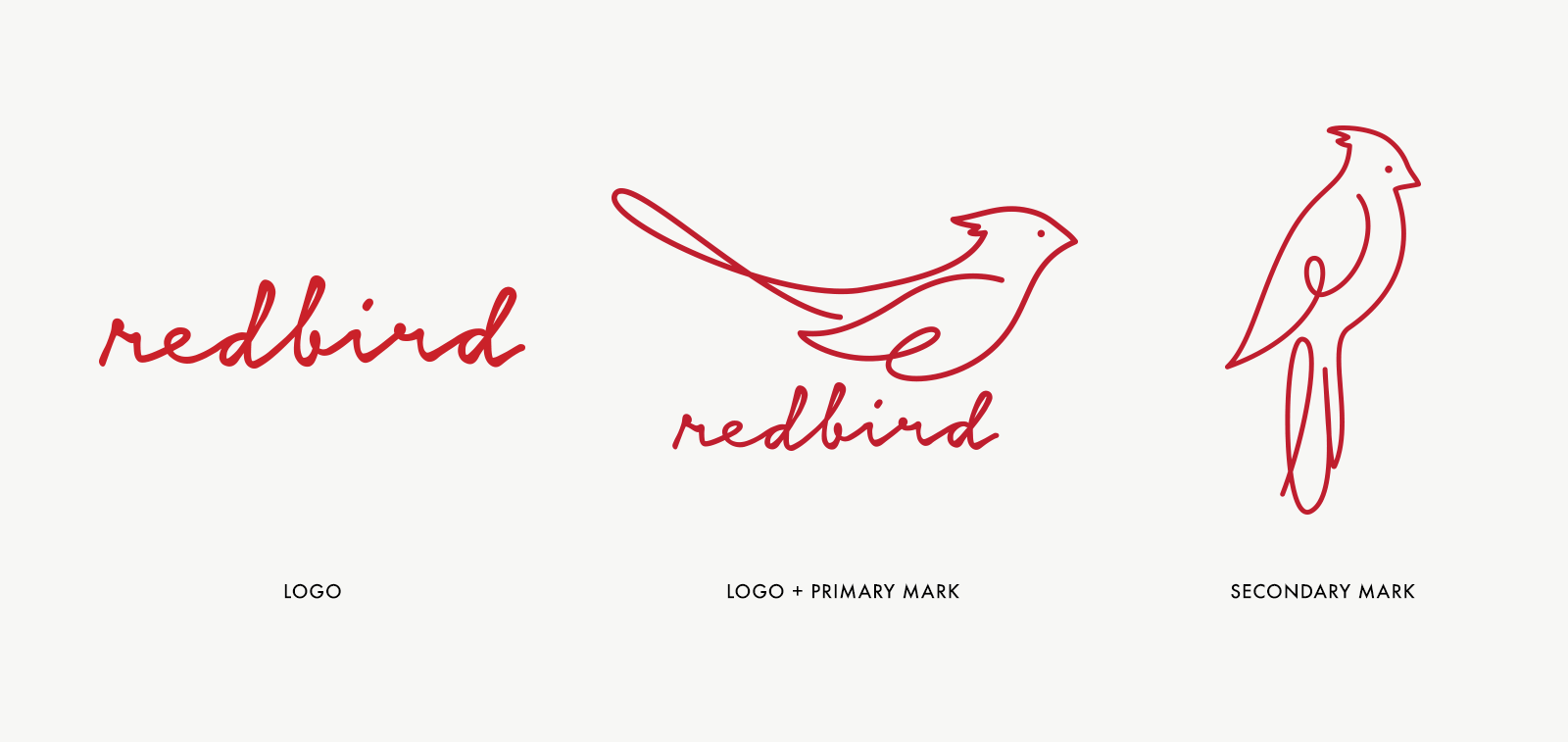
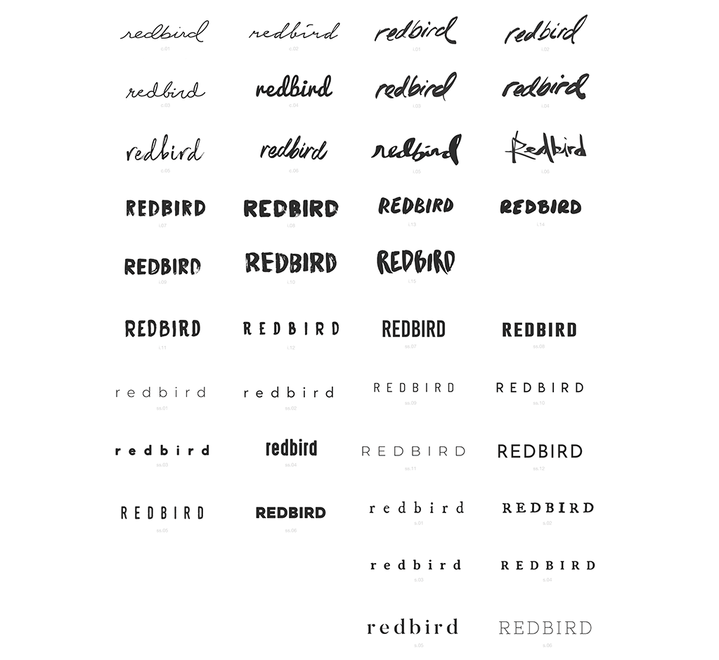
Craftsmanship is extremely important to Zeb, and he welcomes everything that comes with a handmade process, especially the nuances that reveal the artist’s touch. The logo explorations began with scripts and brushed letterforms, but options with set typefaces were also shared to show the spectrum of possibility (and to eliminate what didn’t work).
How would your brand dress?
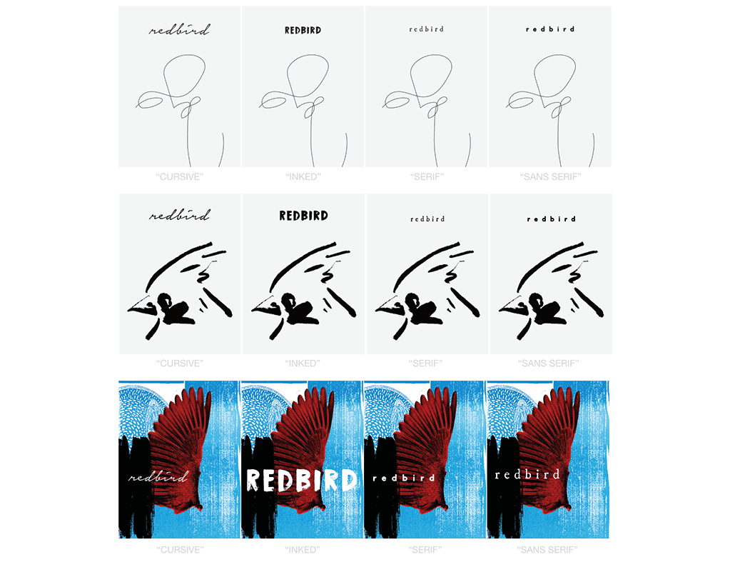
Another exercise to help select the logo involved seeing how the brand might look using specific styles. These experiments in aesthetic approaches were based on various inspirations that resonated with Zeb.
What’s too spicy?
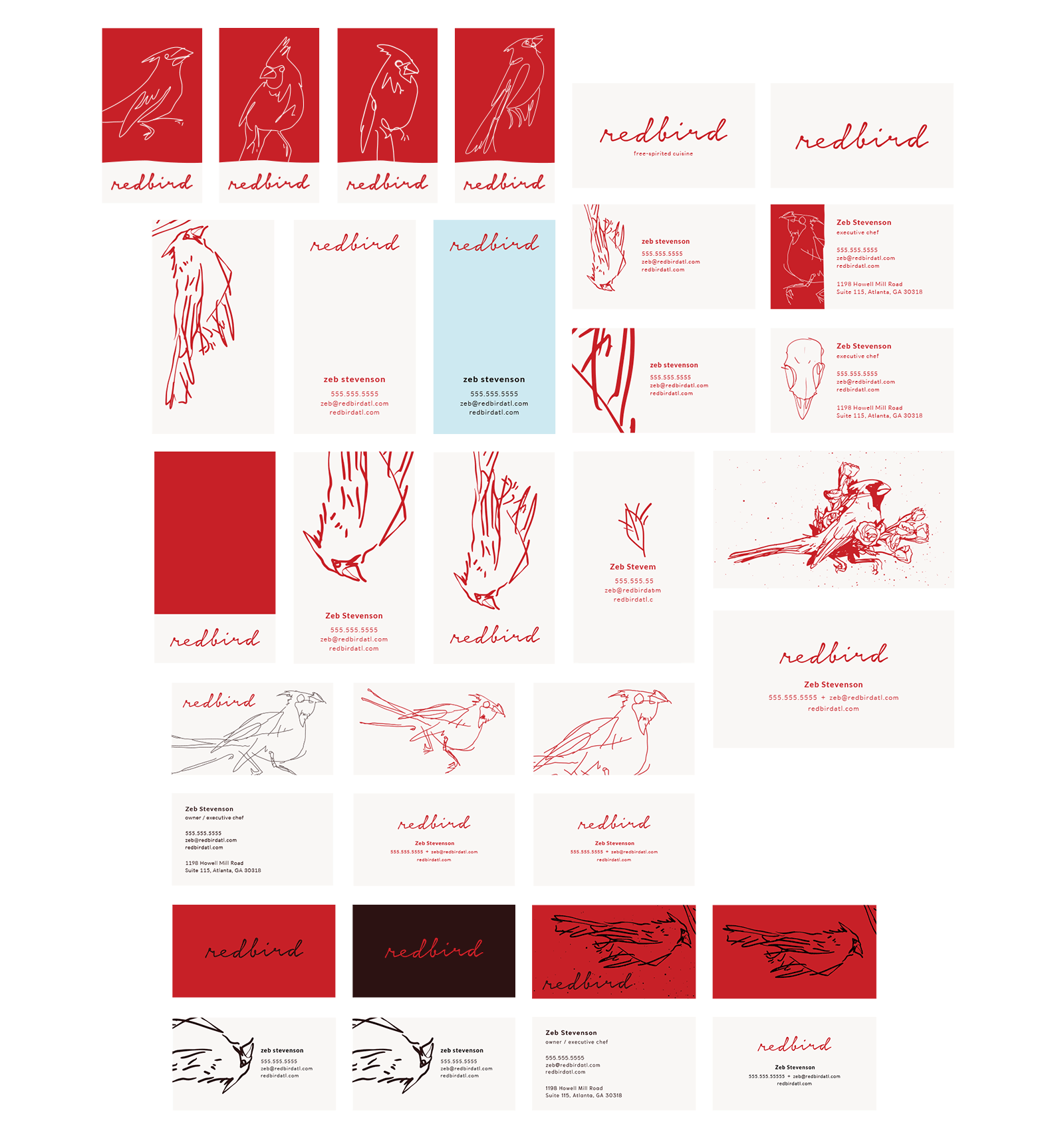
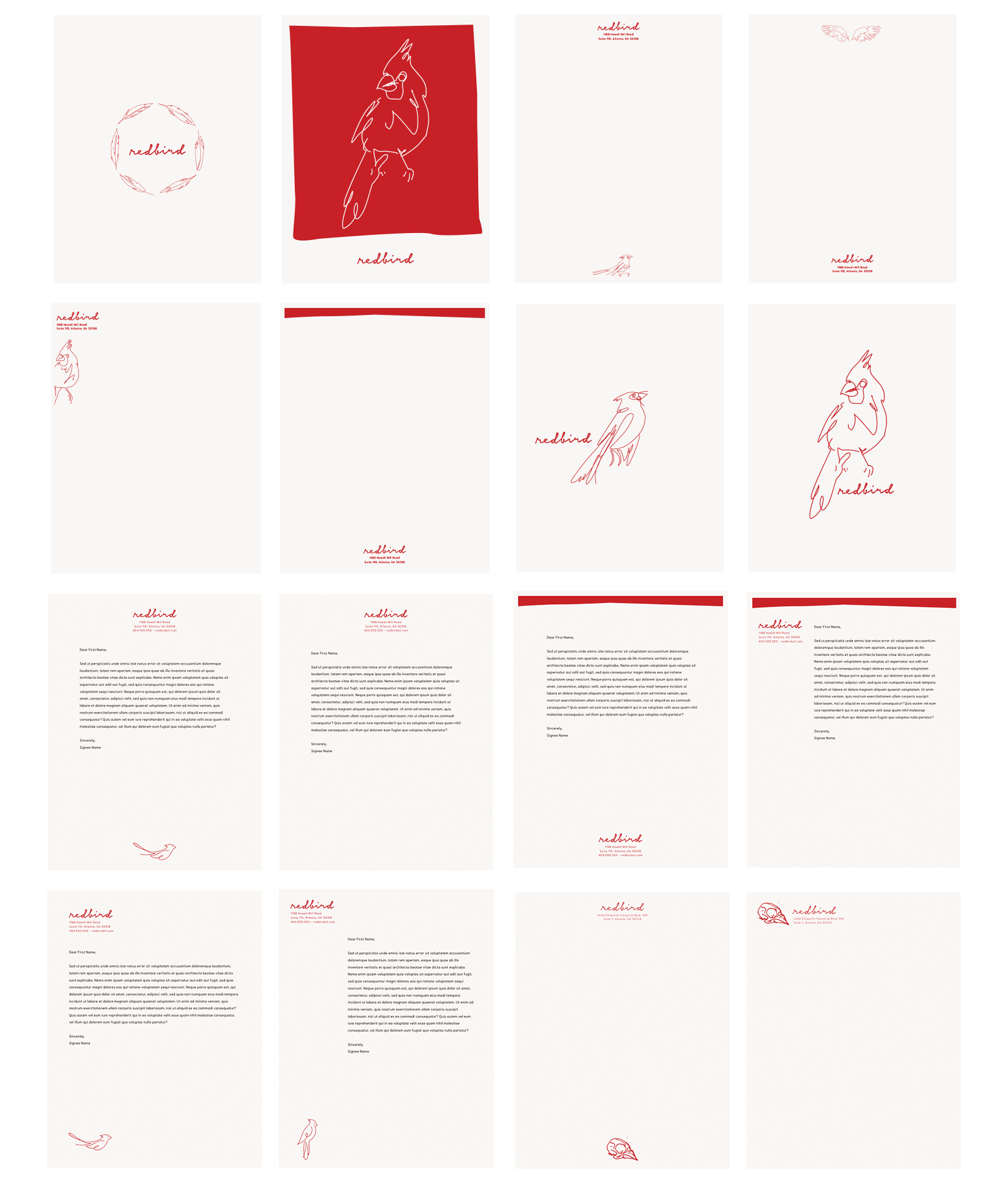
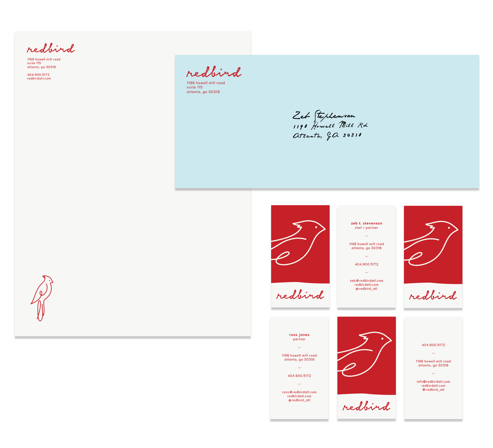
Once the logo was chosen, we went through different iterations of the stationery, trying to refine what felt best.
