Partner: Othús Perfumery
Role: Creative Director, Art Director, Designer, Illustrator
Othús Perfumery was founded with the belief that there should be a return to the origins of fragrances, where nature was embraced, was celebrated, and brought healing.
In developing the brand, certain values, like being nature-based and personal, had to be reflected in the visual identity. Process and transformation were important to show as well.
What were the goals?
The vision for Othús, and the principles that would drive them, were revealed through conversations with the owners. Using their own words, I helped to articulate the brand purpose, brand position, and brand personality, as well as how they wanted to use their visual identity.
Start at the beginning
Othús was originally founded with the name “Roots,” which referenced a return to both nature and how perfumes were once hand-made. These first explorations of the logo tried to capture the spirit of the hand-crafted process.

The mark as a symbol
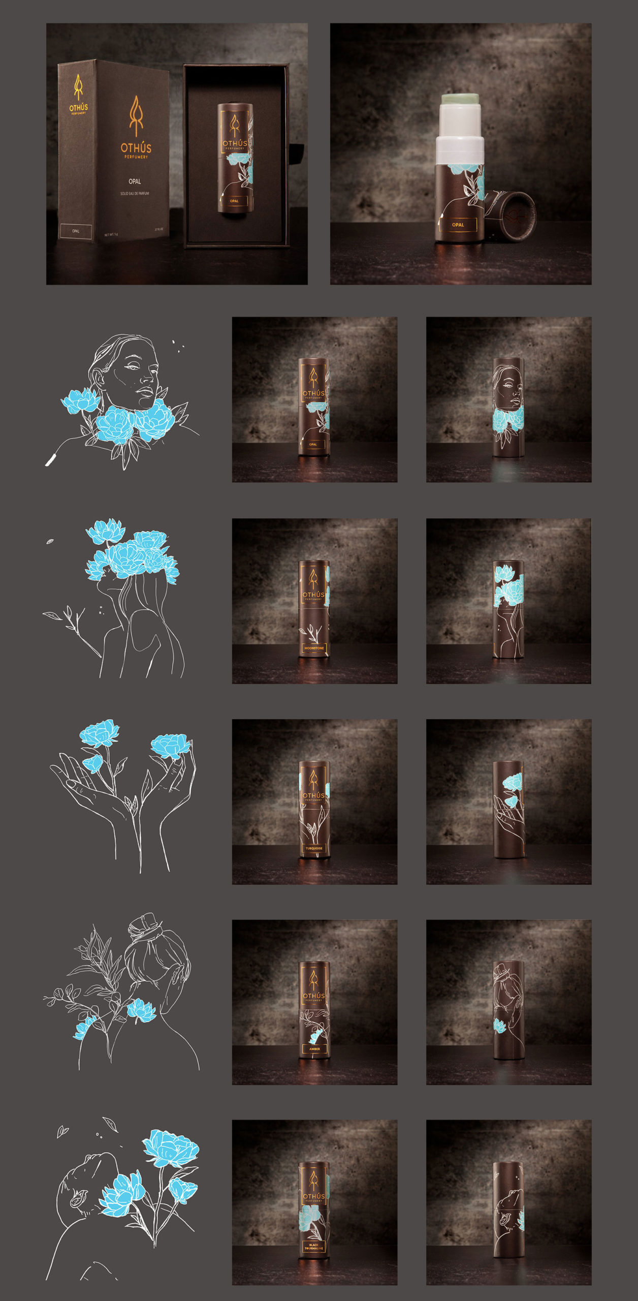
Their perfumes are made using a small-batch distillation process, which produces tinctures and essence oils as ingredients. So, a lot of chemistry, art, and intuition is involved. The process immediately made me think of alchemy and sacred geometry symbols, which inspired the mark.

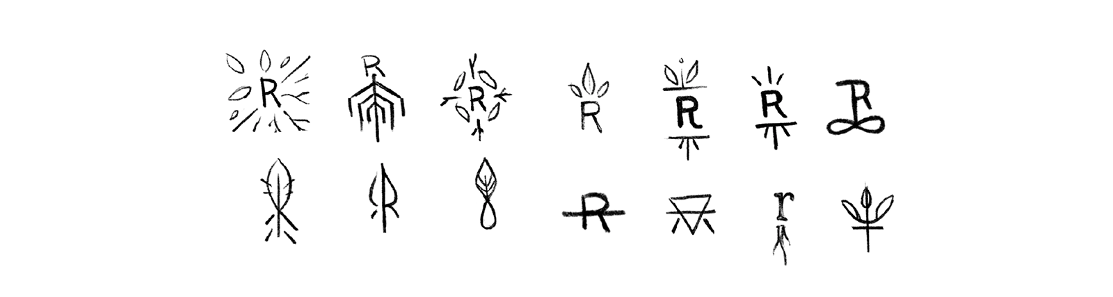
Distilled even further
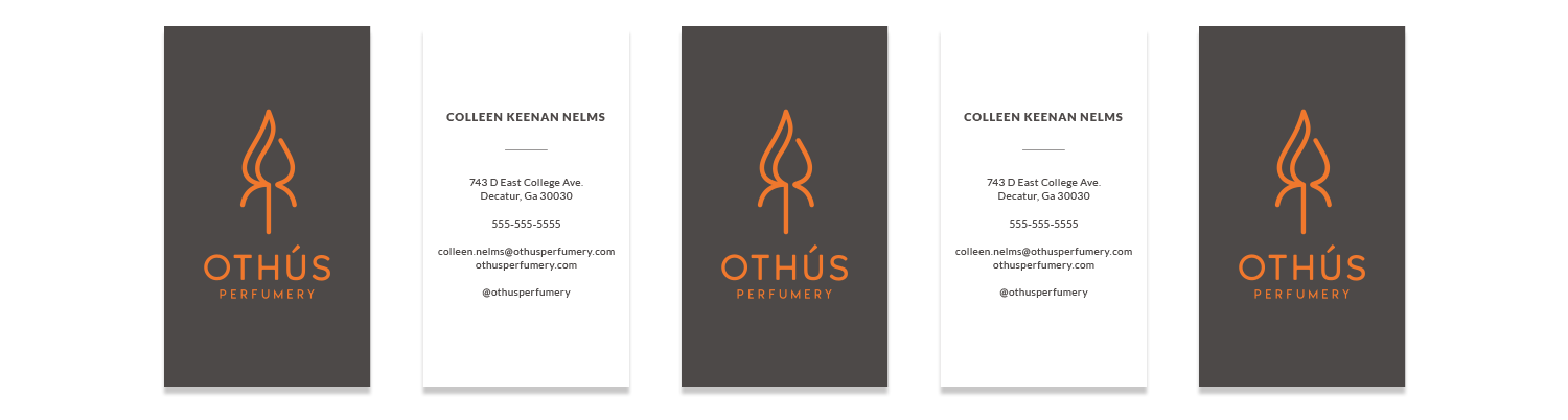
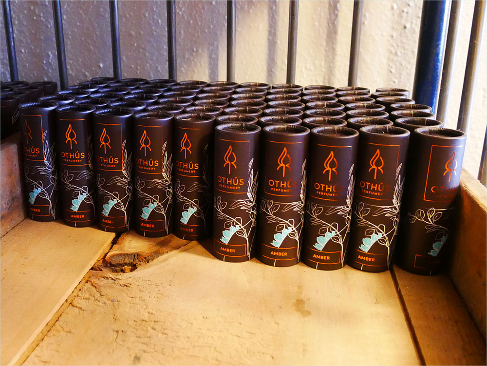
Once the mark was selected, we tried to find a logo treatment that would complement the form and the style. Ultimately, the hand-rendered quality was reserved for the packaging, to be shown through the drawings and the labels (batch numbers are written by hand). It was decided that the logo and mark benefitted from being clean and unadorned.

True to the process of change
Unfortunately, it was discovered that “Roots” was too close in name to another brand for copyright laws. “Roots” transformed into “Othús,” which is a play on the Gaelic term “ó thús,” meaning “from the beginning.” These exercises in using the O letterform, as the flower and as drops of essence oil, were the initial steps before modifying the original R letterform.

Everything from nature
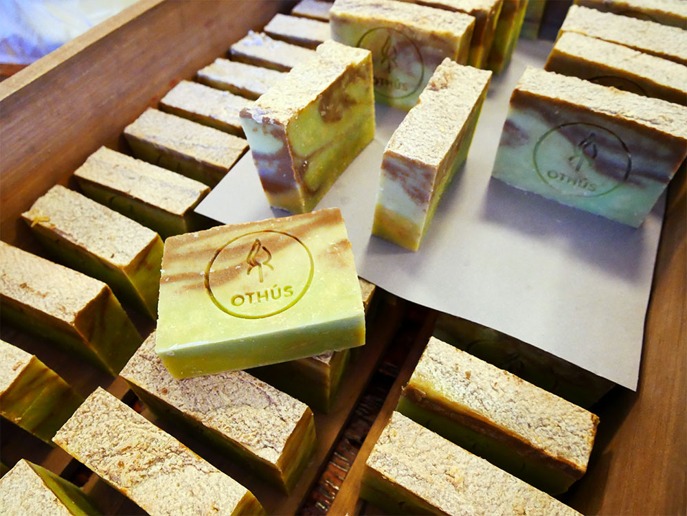
One of my favorite things from building this brand is how the underlying theme of nature permeated the identity. In the initial palette studies, I wanted to make a connection between the elements of the brand and the natural elements. The colors represent earth, water, wind, and fire. The orange-ish color is a nod to the copper still used for distillation.