Client: American Cancer Society
Role: Art Director, Designer, Illustrator
Contributions: content strategy, content creation, creative direction
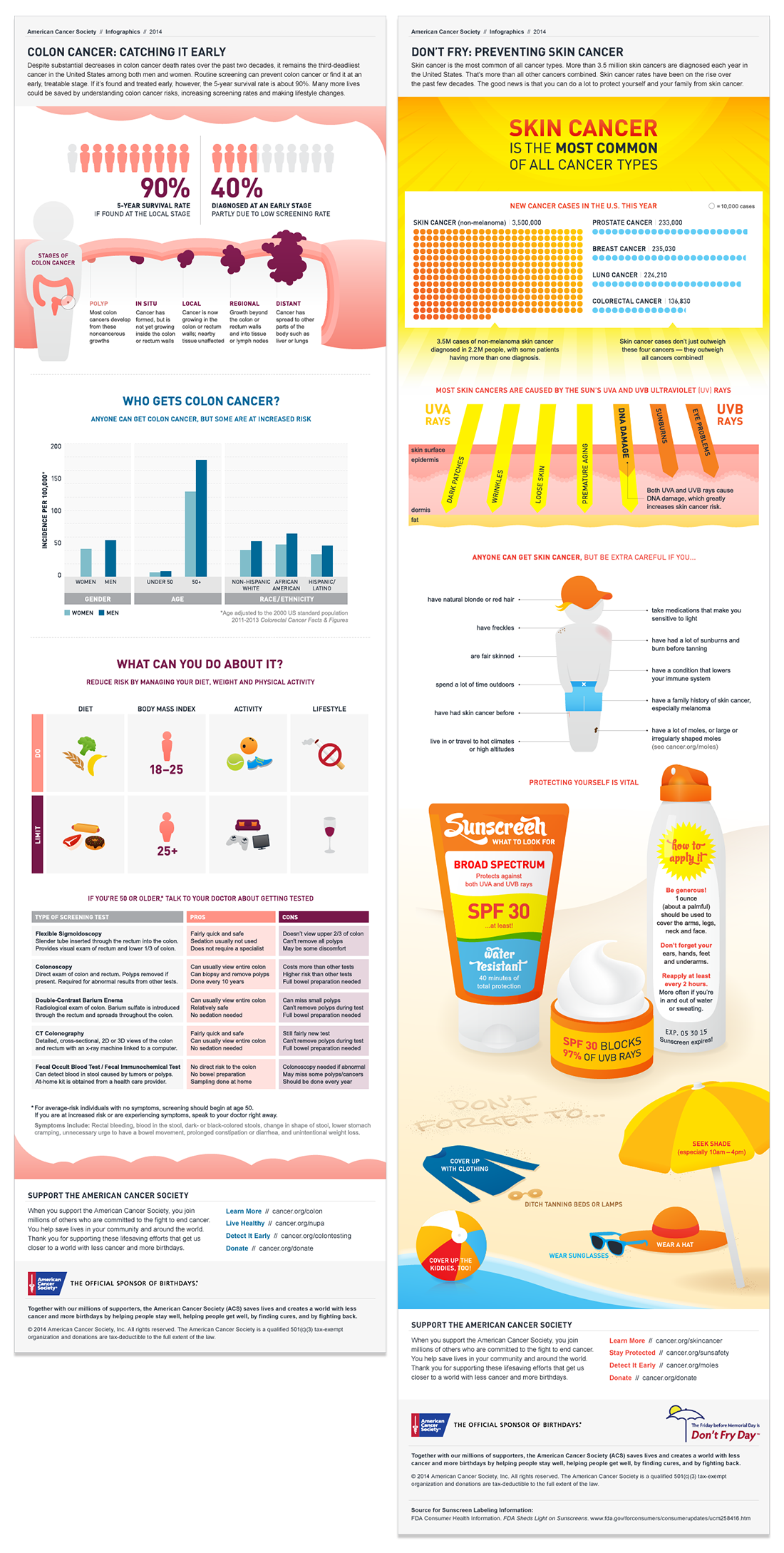
Cancer research and data can be difficult to comprehend, especially when most of the information is generated for other scientists. Papers are often dense, complicated, and unappealing to read. But, that doesn’t mean that the content isn’t fascinating and worth highlighting.
Our cancer.org team proposed a suite of infographics that would bubble up content, usually buried deep within the site, and make it more digestible, actionable, and shareable. We always worked directly with the research team to create pieces that were scientifically accurate.
Shout-out to my friend Gabi for her invaluable work on this project!


